

Two of the biggest steps for making your place finally feel like home: painting the walls and putting up art. I can’t help you paint your walls, but I can help you choose the best frame for your artwork.
Getting your prints framed will give the artwork a more finished look. To make sure you love the end result, here are five tips on how those frames should be chosen.
NB: Every canvas print offered on this website comes with the option of a Walnut, Black or White 'floating' frame. How the frames discussed below may not be of the same style. However, several customers opt to frame the prints themselves for a more customized look. I recommend using a professional framer for this.

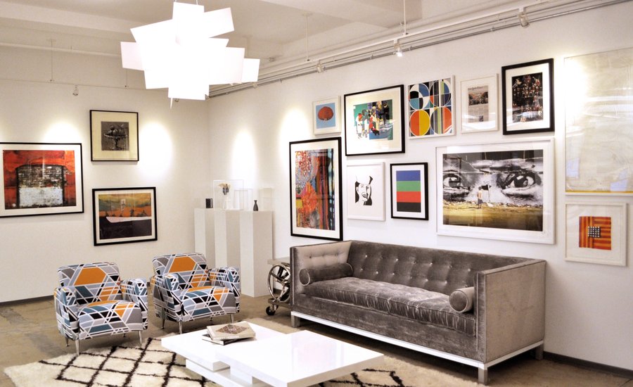
Photo via ArtSpace.com - The old Artspace office
1. Check your undertones
Most paint colors are created by mixing two or more colors together, meaning that every shade has a mass tone (the color you register the paint as, like beige, taupe, blue, etc) and an undertone. It’s these undertones that hold the key to a cohesive interior, and identifying them will help you choose frames that complement your color palette.
So how do you identify the undertone of your paint color? Compare your paint color to its closest “true color” relative.
Bonus: Get access to my exclusive Insiders' Newsletter to receive free monthly wallpapers straight to your email, just like the photos on this website!
For example, if your walls are an off-white or cream, use a paint swatch or color wheel to compare it to red, yellow, and blue-based creams. Your closest match will indicate your undertones. Many colors that are often considered cool (like gray and white) actually have warm bases. Testing it against a known swatch is the easiest way determine what undertones you’re working with.
Now that you know your undertones, you can choose your frames. As a rule of thumb, silver frames match perfectly with cool undertones and gold frames with warm undertones.
For example, a cool pale blue will look lovely with silver frames in a range of tones (from champagne antiqued frames to sleek true silver frames). Meanwhile, any room with a warm undertone will look amazing with gold frames.
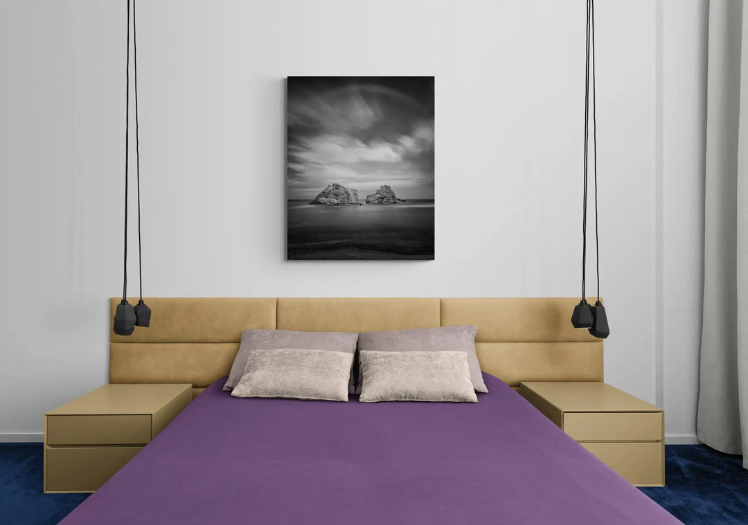
2. White and black are the new neutrals
Simple black and white frames are endlessly versatile. They work with all interior styles, wall colors, and art colors. It’s like magic. That said, depending on the look you’re after, you might have a preference.
For example, it may be a good idea to pair a sleek white frame and white mat with a bright white wall. It makes the art the true focus of the interior, the frames adding sophisticated dimension and subtle texture. A similar effect can be achieved with black frames on dark walls. For this look, you can opt for a white mat, dark mat, or one of our favorite modern looks: no mat at all.

Photo via Decoholic.com
Related: 8 Tips to Enrich your Art-Buying Experience
3. Match your whites
If you pair a white frame with a white wall and it doesn’t look quite right, it’s because the undertones of the whites aren’t aligned. Here’s the secret, if you have an off-white or cream wall, a bright white frame will look too stark against it.
Similarly, make sure your mat color works with both the frame and your walls. For example, if you opt for a bright white frame to complement a true white wall, also choose a white mat.
4. Go beyond the walls
While wall color is definitely important, don’t underestimate how the colors and tones of other design elements may impact your overall interior palette.
Think about your crown and base moulding, any tile backsplash or floors, the tone of wood floors and cabinets, and the colors of your counter-tops and even furniture!
All these elements can draw out the undertones of your wall color, especially ones that are not immediately apparent.
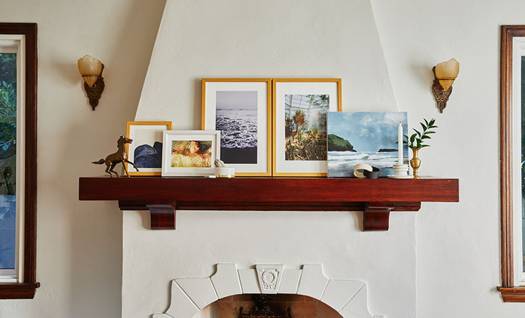
Photo via Society6.com
5. Don’t worry about matching your art to your walls
Some people might spend ages looking for the perfect art piece for a specific spot in their home, like the perfect blue-toned abstract art print for the guest bedroom.
That’s a perfectly good way to approach decorating, but I suggest always choosing art you really love (read: 5 Tips for Buying Your First Piece of Art), even if it doesn’t “match” the rest of your interior style. A frame with the right color undertones can tie together a wall, and the whole room. It’s kind of magical.
I loved that you pointed out that white and black frames are versatile, so they can work with all wall colors and interior styles. This sounds like a good tip for me because I am planning to order custom picture frames next Monday. I usually change the paint color of our living room’s walls every 3-6 months, so it will be cost-effective for me to consider your tips. https://artoriginals.com
Leave a comment